
Projects
About


BRIEF : "In this Challenge you will design a unique character from an ancient civilization. One character design for ancient heroes, and one character design for ancient villains. Each character will tell their own story with their clothing, adornments, and gestures. It’s not enough to create anatomically correct characters. You will need to tell a compelling story that draws us into the time, the people and the drama of your ancient civilization."
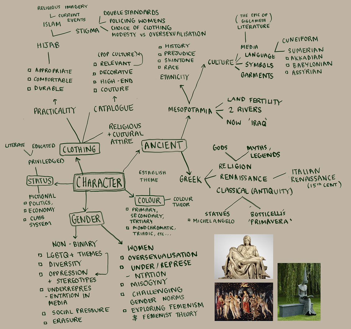
My first mindmap covering all the intertwining subjects I wanted to explore in this CMP.


To summarise my findings, hijab isn’t strictly islamic, and it’s almost always a woman’s sole choice to wear one. Another finding is that depending on location, Islamic traditions and garments aren’t enforced or common. Taking this into consideration, I will use this to develop a target audience and basis for my response-oriented studies.
I will try to cater (even if it’s minimally) for hijabis/other modest members of society, and give them a character/sequence of characters that wear such headscarves. This allows them to explore cosplay and the such, whilst also introducing a more diverse assembly in the world of character design. This simultaneously defeats the preconception that a successful piece of media must feature a sexualised woman for responses - in the same way Black Panther was successful because it showcased Black characters, my project can be successful for the hijabi and female community.
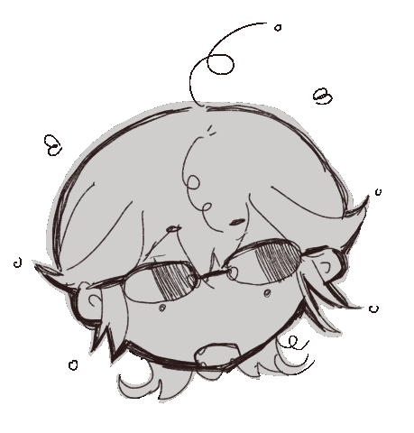
My character will be a (or the fictional equivalent of a) Mesopotamian/Iraqi gender-ambiguous but femme presenting late teen that iconically wears a headscarf. She will be robed in jewellery to evoke a sense of wealth, knowledge and fluidity, as well as the modest. Since she is not Muslim, her inclination to wear hijab religiously isn’t relevant, but she faces the same prejudice if she were.
My selection of hand drawn simple sketches inspired by my moodboards. Simplifying them to basic shapes helps me be more decisive, as it's much more telling of character than subtle intricacies.
My more narrowed and sharp silhouettes. My favourites were developed into more rigid sketches.
Name: Aani
[Of Arabic origin, meaning 'a Literary Woman, a Poetess']
Age: 19
Gender: Female
Ethnicity: [Inspired by Mesopotamians]
Language: [Inspired by Sumerian]
Skills/abilities:
- Literate
- Multilingual
- Activates gemstones
- Psychic abilities
- Masterful scribe
- Author (carves stone tablets)
- Strong shield
- Communication & debate
- Adaptability
Likes:
- Writing
- Theatre/Dance
- Lyrical writing
- Gemstones
- Fresh water
- Sea animals
Dislikes:
- Ignorance
- Misogyny
- Gender binary
- Butterfingers

COMPARISONS:
Though I believe I did well on my overall project, there are definitely many improvements to be made. I’ve judged this by looking and comparing my work to my chosen case study artist - Knight Zhang/(pen name) Arucelli. Her typical character design sheet consists of an array of charcoal gesture drawings on one page, expression sketches on another, and a fully painted/detailed portrait painting. Though I tackled the brief in a different fashion (because I started with silhouette drawings) I aimed to have the same array of character gestural and facial studies. Unfortunately, most of my time was taken up by working on and solidifying the outfit. This was because my main focus was on the clash of social expectations and fashion. Therefore, my main selling point would’ve been the progressive nature of the topic I chose.
Since Arucellis’ character is heavily based off a culture that still has mediums and articles thriving today, it must’ve been easier for her to stick to real life geographical, cultural and religious inspiration from the symbolism to the garments. I was overwhelmed with the task to create an entirely unique and imaginative Ancient world in such a limited time period. As a result, I did not have the confidence or references to complete a detailed painted portrait of my character. Perhaps I didn’t have the skill to entirely paint a face from imagination (since there are few model images of Middle Eastern women online) otherwise I think I would’ve easily completed this section.
RESEARCH & PLANNING:
I did my best to maintain the relatively simple concepts I first started off with. Since my research and plan had great breadth and range, it was a challenge to include all of these with equal distribution and relevance. Starting off with the religious take, my foremost priority was making an example of misogyny AND islamophobia, demonstrated in the misconceptions and ignorant assumptions as a response to women’s fashion and clothing. I believe I did a good job at maintaining this by keeping my female character wearing a headscarf (seemingly hijab). The point I made was well kept where, despite her religion being unknown, she withstands the same misconceptions from select antagonising characters she may face. It’s almost impossible to convey this in a single character design, and would have to be developed in the narrative. I partnered this goal with the practical aspect of my design - the fact that it’s designed for game. Thus, I needed to take into account the reception and traditions of such games.
Typically, female characters are used as a marketing tool to appeal to their audience (majority straight males) by being sexualised. This has only further enforced harmful stereotypes and methods of limiting women to being sexual objects. This could very well have an affect on young and influential viewers, where they cannot empathise with female peers as a reflection of their perception of female characters in media. I found that studies have shown a link between societal standards affected by tv/movie/game tropes such as the ‘Male Gaze’.
However, I avoided the classic character-designer temptation and didn’t succumb to expectations/essentials of using hair as a tool by instead keeping the hijab. Another aim of mine was to use fabric and cloth folds as a tool for expression and fluidity, because I was inspired by classical renaissance statues. Unfortunately, I didn’t get round to completing any fold-studies, or attempt realism. Therefore I feel that the depth and mass of my characters clothing is not yet realised.
Considering my characters gender (presumably female), it already answers the question of whether I fit her into the gender binary or not. I feared it would've looked like tokenism because I wouldn’t have had the time or means to research and take even MORE precaution in order to honour and serve the community. Trying to fit every minority trait into one character is exhausting and doesn’t allow the viewer time to acknowledge or empathise with each struggle, but rather trivialise it into just one playable figure.
During my research stage, I looked into the history of Mesopotamia - the first civilisation known to man. Taking into account visual design in particular, I had to convey some of the information I had learnt, one of them being the very fact that Mesopotamia was a fertile land with two planes of line divided by a river. I had to figure out a way to translate the elements of earth and water harmoniously. This successfully reflects on her internal nature, being the perfect balance of 2 cultures/areas/languages and bridging them. I wish I had done more studies into the symbolism of water, but I believe I did a good job because I photo-bashed textures of rock and aqua coloured marble, some of which allude to a glimmering ocean.
This leads me on to my 'stone motif'. I think I mostly achieved this because of the photo-bashing techniques I used to make her body seem like a dynamic, rustic statue or block of carved stone. I didn't want to lose her humanity, however, so it's less opaque than I would've made it. I find it that texture is the most gripping way of showing variation, instead of limiting it to the environment. It also makes the fictional world seem more believable, rather than being a regular human society, they are alien/sub-human. This is so that I could fit the brief of it being a fictional ancient civilisation. looking back on the submissions, my concept is equally as creative, only less direct because I have fewer characters to show a theme, consistency or pattern.
Judging Success
COMMUNICATING OVERALL MESSAGE:
In short, my overall message was to demonstrate a progressive take on 'the headscarf' in a suiting, unique environment, as explored by a strong female lead. In my opinion, I have totally achieved this. She is a fully, modestly clothed female-protagonist based in a sub-human world inspired by Mesopotamian culture and history.
TARGET AUDIENCE:
If I had another go of the same brief, I would definitely do a lot more research into the target audience. The website Statista is usually my go-to, but unfortunately I couldn’t access any statistics about my niche audience, which makes it harder to find information because the potential is narrower. This would e helped significantly when choosing the perfect and most suitable game-type, which was never fully described. I had a stronger vision than I did practical ideas for this, so it’s hard to tell the direction of my game plan. Ideally I’d have invested in statistics to accurately suit people’s wants. Since I’m not familiar with the Twitter community either, I should’ve stuck to a more close-to-home fan base that I can readily analyse. Despite this, I believe my game fits the needs of my target audience profile, mostly due to my social cautious and awareness.
AESTHETICS OF DELIVERABLES:
The aesthetics are usually my area of expertise, but I excelled in the planning and research. Considering my final product, I am quite pleased - the marble looks beautifully aquatic, and the rock texture isn’t too distracting. The colour scheme explores split-complementary colours, where, the main body is an off-yellow or peach, and has an accent of aquamarine, teal and navy. These colours work successfully to bring balance to the eye, and additionally reinforce my plan of conveying water as well as the earth. Initially I wanted to use a bright-salmon colour because I saw it worked well with another statue well, but once I saw it in my 2d design, it didn’t look earthy and dirty enough, but rather neon. The colour pink itself didn’t lend to her character. I find that overusing pink often seems like a tacky or forced approach to depicting femininity. Though ‘inking’ is usually an important part of my art, I decided to completely remove it from my design. I had struggled with my art before starting the project, so making a drawing that I was pleased with was very hard. Overall my aesthetics didn’t fail me and worked well in the end, but I am displeased that I didn’t exceed my standard or experiment with style.
DISCUSS FEEDBACKS:
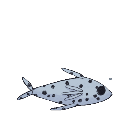
For this particular project, asking feedback from peers and teachers and family was informally carried out. Instead of demanding people toco pledge a form, I asked one-on-one what they preferred or suggestive, based off their own expertise or valid opinion. Many of my followers on my art account belong to my target audience, so uploading polls came in handy. I’d take every piece of suggestion - for example-le, I asked a teacher Katherine for how she interpreted my character/list what it reminded her of. She responded with the following: “jellyfish, aquatic, fish, turtle”. What I understood from this was that my design was too silky and liquid. Responding to this feedback I overlayed and photobashed rock images to the design. This added texture and I asked for feedback again. This time she agreed that it had a very rocky, earthy and dusty (as well as being terrestrial), which is exactly what I was aiming for.
CHECK PROPOSAL:
Looking back now, I didn’t spend a lot of time sticking and referring back to my project proposal. This was due to the unreliable time schedule I had out for me, where there were unexpected announcements due to covid and social distancing measures. It’s hard balancing two worries. Aside from the schedule chart, I stuck to my main principles.
WHAT RESEARCH HELPED, WHAT TO ADD:
Most of my research was support and confirmation of my plans or ideas. When marketing a progressive piece of media, you have to be e careful in not ignorantly creating problematic subtext. The research surrounding Muslim women’s opinions on Hijab and cosplay was particularly important in empathising and catering to what they would probably like to see in media, which is a rarely explored area. I would’ve definitely done a lot more in depth research into Sumerian language and symbolism. This would’ve helped add in subtle but educated detail into my characters design - I had hoped to carve Sumerian characters into her outfit or look at intricacies in culture.
TIME MANAGEMENT:
This is definitely the area I struggle most in. Majority of my time I had procrastinated starting production, though my planning and research was completed smoothly. I occasionally missed deadlines, and overestimated how long I had to complete it, since I was so used to finishing 3 projects at once. If I had started making the final deliverables sooner, I’d have a lot more time to perfect and make a piece I was proud of.
3 THINGS I LIKED - 1 THING TO IMPROVE - PROJECT MANAGEMENT SKILLS - DESIGN SKILLS - WHAT ID DO DIFFERENTLY:
I certainly liked my initial concept - I believe I chose very unique, intriguing and critical subject matter. It was well thought out and informative instead of following basic trends. I also liked my silhouettes - I felt that they were all very elegant and conveyed the perfect balance of authority and intellect. My planning and research stage was well articulated. One major thing to improve was researching on practical gaming functions, mechanics and genres. Without this very basic foundation, I struggled to pick a strong storyline.
I managed my content well because I kept every body of text in organised folders within my notes app. I arranged everything neatly and kept note of every website URL I used along the way, instead of scrambling for it afterwards. Same goes for any online app I used - Pinterest had separate boards, my Procreate had separate stacks and my Image Gallery in Drive had everything I need to add to my production log, so I could access it anywhere. I occasionally checked back with my research and proposal, though I sometimes relied on my tutor to keep me active.